Skip to content
View in the app

A better way to browse. Learn more.

Wanderers Ways. Neil Thompson 1961-2021

A full-screen app on your home screen with push notifications, badges and more.

To install this app on iOS and iPadOS
  1. Tap the Share icon in Safari
  2. Scroll the menu and tap Add to Home Screen.
  3. Tap Add in the top-right corner.
To install this app on Android
  1. Tap the 3-dot menu (⋮) in the top-right corner of the browser.
  2. Tap Add to Home screen or Install app.
  3. Confirm by tapping Install.

New Shirt Sponsor...188bet.com

  • Replies 319
  • Views 28.8k
  • Created
  • Last Reply

Top Posters In This Topic

Posted Images

Featured Replies

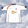
SHIRTSS0910.jpg


well thats a bit exciting?


what's with all the stripes and stuff


i'll have to see it in the flesh before i decide if it's gopping or not

I THINK IT LOOKS HIDEOUS !

Why not have something simple instead of lines and wiggles all over it ?!

After last years design i really thought an effort would be made to make the shirt a good one.

Eh well :bad:

Looks like a Preston kit from a few years back

3 new kits in 3 years is the work of shithouses.


And it's a shit kit to boot.

Awful, worse than this years.

The kit is a shocker. I would have only been interested in the kids kits (dont wear them myself) however looking at them without any sponser on at all makes that look even worse. Lets hope the away kits look better.


SHSSJNR0910.jpg

Edited by forever white

The kit is a shocker. I would have only been interested in the kids kits (dont wear them myself) however looking at them without any sponser on at all makes that look even worse. Lets hope the away kits look better.


SHSSJNR0910.jpg

Ye your right the kids one looks pathetic with a big blank space :blink:

Could they not have stuck reebok there ?

Here's a thought - wouldn't you think that the club would test out some of their designs on some supporters first?


I think its a revolutionary idea called test marketing.


Instead they seem to let some loon loose with a pack of Crayola and do an ip dip, dogshit on the resulting bollox that they produce.

What a shame.


I looked at it and thought WOW brilliant! Then I saw the shit stripes below.


Always got to go one step to far.


Oh well, better than the previous shirt.

Hideous. I thought it was an impossible task to make a kit worse than this year's but they have managed it. Money staying in pocket.

1913 - 1945 really were the pinnacle years of outstanding design...

SHIRTSS0910.jpg


Bit of a better image. I think it would have looked far better if they hadn't had but the bloody zebra crossing at the bottom of the shirt!

fcuking rubbish


and whats with that stripe only on one shoulder


cocks

Dreadful - a total and utter mess. BWFC really tick me off with this, you go in our club shop and its donkey. All the clothes products no one with any sense of fashion would be seen dead in them. Boring polo shirts, those stupid training tops and those massive coats. The women's wear is just awful and the kids stuff unispired. The other tops clubs such as Chelsea do loads of stuff for men and women that looks ok, why can't we? Its not like we're lumbered with dreadful club colours like Burnley or Norwich - white and navy blue should look good, not this mess.

It looks like they've sewed half a West Brom kit from the early 90's on the bottom - it's feckin disgusting.

Looking back through the historic kits - every Reebok kit bar maybe the first has been utter shyte

Looking back through the historic kits - every Reebok kit bar maybe the first has been utter shyte

My fave kits where the 93-95, especially the away kit was a good un,

Also i think the 05-07 wasn't a bad effort.


A plain white one would be an improvement on this years cack

I looks like they randomly added bits to it, Bizarre. And there's no Lancashire Rose red on it whatsoever. IAMOUT until they are ?4.99 at Sports Direct.

SHIRTSS0910.jpg


Bit of a better image. I think it would have looked far better if they hadn't had but the bloody zebra crossing at the bottom of the shirt!


lose the stripes


and the shitty looking sponsor


put reebok back in


and it's not a bad effort


bet noballs is getting a right b?ll?cking now

bet noballs is getting a right b?ll?cking now


As I said yesterday:


I don't suppose it matters then that it's nowt to do with me? :pardon:


:nea:

As I said yesterday:


:nea:


Do you know who did design it?


Can you tell them from us it's shyte?

I couldn't really give a pissflap! i've seen worse kits, and i don't wear them anyway. lets be honest it's not going to make any players better or worse is it?

lose the stripes


and the shitty looking sponsor


put reebok back in


and it's not a bad effort


:good:

Edited by Gaz Nt

Account

Navigation

Search

Search

Configure browser push notifications

Chrome (Android)
  1. Tap the lock icon next to the address bar.
  2. Tap Permissions → Notifications.
  3. Adjust your preference.
Chrome (Desktop)
  1. Click the padlock icon in the address bar.
  2. Select Site settings.
  3. Find Notifications and adjust your preference.